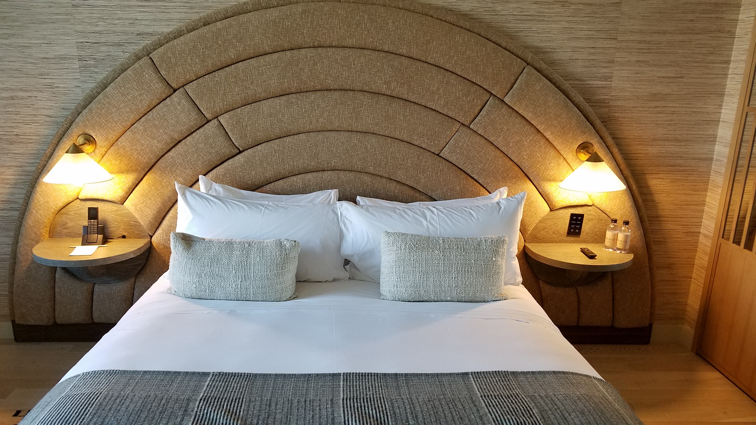
Hotel Bathroom Amenities Face Accessibility Design Crisis
Industry-wide labeling failures leave guests guessing between shampoo, conditioner, and body wash in the shower.
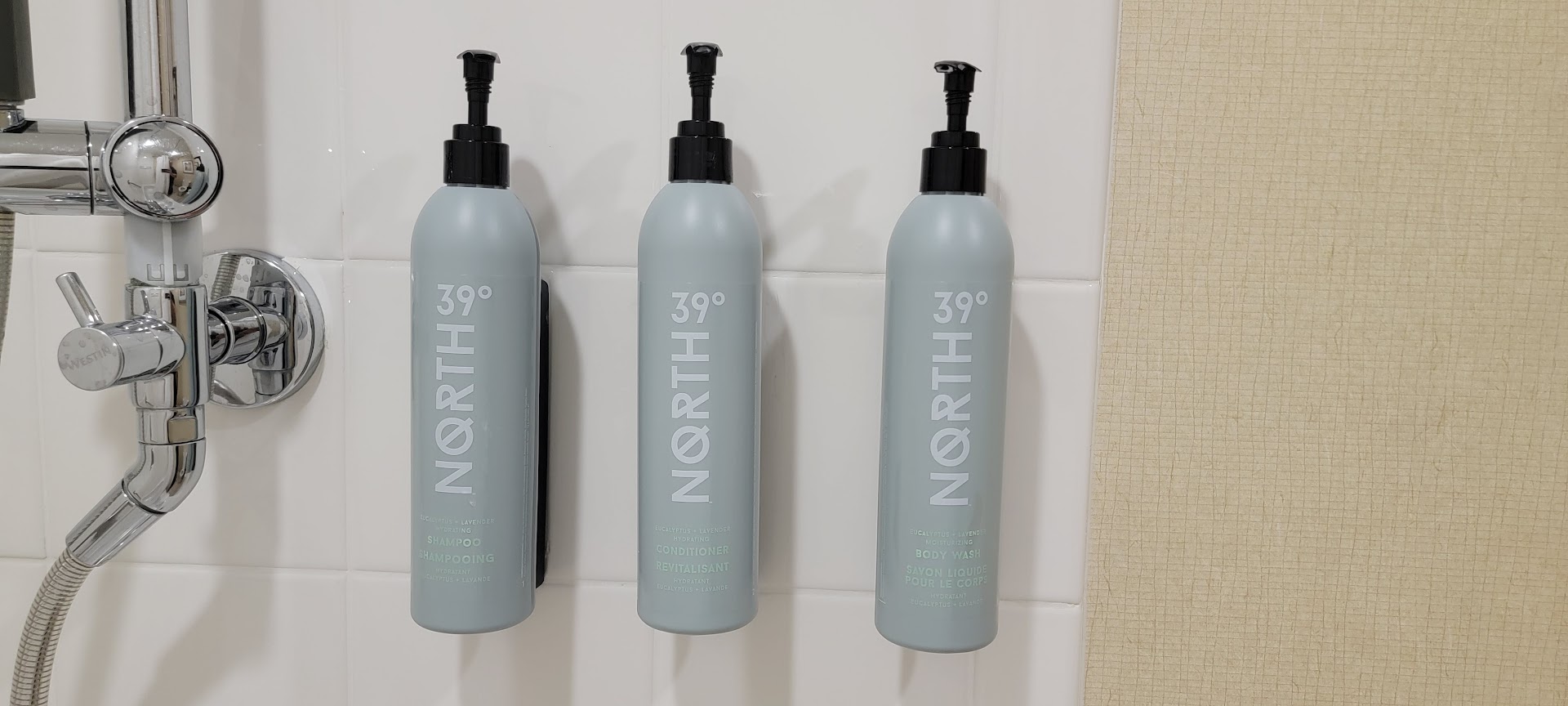
Image via View from the Wing
Key takeaways
- Hotel bathroom amenity bottles frequently feature small, low-contrast labels that are difficult to read in shower conditions
- The design problem particularly affects guests who need reading glasses but aren't wearing them while bathing
- This represents a basic accessibility failure that forces guests to guess which product they're using
- The issue spans multiple hotel brands and price points, indicating an industry-wide design oversight
The Problem Every Hotel Guest Recognizes
A widespread design flaw in hotel bathrooms is frustrating guests across the hospitality industry: amenity bottles with labels so small and poorly contrasted that they're virtually impossible to read when you need them most—in the shower, without glasses.
The issue affects shampoo, conditioner, body wash, and lotion dispensers in hotel rooms worldwide. Guests find themselves squinting at tiny text or holding bottles inches from their faces, trying to distinguish between products while water streams down. For the millions of travelers who rely on reading glasses, the problem becomes a daily guessing game during their stay.
Why This Design Failure Persists
The labeling problem reflects a fundamental disconnect between aesthetic priorities and practical usability in hospitality design. Hotels often opt for minimalist, visually uniform packaging that looks elegant on bathroom counters but sacrifices readability. Low-contrast color schemes—such as white text on translucent bottles or embossed lettering that disappears in certain lighting—compound the problem.
This isn't merely an inconvenience for a small subset of guests. Vision changes affect most adults over 40, and reading glasses are rarely worn in the shower. The design oversight impacts business travelers, families, and leisure guests alike, regardless of the hotel's star rating or price point.
What It Means for Travelers and Hotels
For guests, the immediate consequence is confusion and wasted product. Using conditioner as body wash or applying shampoo twice wastes time and creates frustration during what should be a straightforward part of the travel routine. Some travelers report bringing their own products specifically to avoid the label-reading challenge.
From a hospitality perspective, this represents a missed opportunity. Guest experience depends on countless small touchpoints, and bathroom amenities are among the most frequently used hotel features. Properties investing thousands in room renovations often overlook this basic accessibility consideration.
The solution isn't complex: larger fonts, high-contrast color coding, raised lettering, or tactile indicators could resolve the problem without sacrificing aesthetic appeal. Some accessibility-focused designs use distinct bottle shapes or color-coded caps to differentiate products without requiring guests to read fine print.
The Broader Accessibility Context
This labeling issue fits into a larger conversation about universal design in hospitality. While hotels have made progress on mobility accessibility and ADA compliance, visual accessibility often receives less attention. Yet readable labels benefit all guests, not just those with vision challenges—they're useful in dim lighting, for guests without their contacts in, or when steam fogs up the shower.
Hotels that address these seemingly minor design details demonstrate attention to genuine guest needs rather than just following aesthetic trends. As the hospitality industry continues recovering and competing for guests, these practical considerations may differentiate properties more effectively than another pillow menu or lobby redesign.
For now, travelers might consider packing a small set of travel-sized products in clearly marked bottles, or simply feeling the texture of hotel amenities to distinguish the thicker conditioner from runnier shampoo and body wash—an imperfect workaround for a problem that shouldn't exist in the first place.
Frequently asked questions
Why can't I read the labels on hotel shower bottles?
Hotel amenity bottles typically feature small fonts and low-contrast designs that prioritize aesthetics over readability. The problem is especially acute for guests who need reading glasses but aren't wearing them in the shower.
How can I tell hotel shampoo and conditioner apart without reading the label?
Conditioner is typically thicker and more viscous than shampoo. You can also feel the texture between your fingers—conditioner feels more slippery and substantial. Some bottles use different shapes or cap colors, though this isn't standard across hotels.
Do luxury hotels have better-labeled bathroom amenities?
Not necessarily. The labeling problem affects hotels across all price points and star ratings. Some luxury properties actually use more minimalist designs that can be harder to read than mid-range hotels with simpler packaging.
Should I bring my own toiletries to hotels because of this issue?
If readable labels are important to you, packing travel-sized products in clearly marked bottles is a practical solution. This also ensures you have familiar products and can avoid the guessing game entirely.
Are any hotels addressing this accessibility problem?
While some properties use color-coded caps or distinct bottle shapes, there's no widespread industry standard for accessible amenity labeling. Universal design principles suggest high-contrast labels and larger fonts would benefit all guests.
Sources
This article was synthesised and fact-checked from the following reporting: